GVSU Social Blog
Permanent link for How to Optimize Graphics and Images for each Platform on March 15, 2022
When promoting an event or program, graphics are a great way to share information in an exciting, visual way. Whether you make your graphics in Canva, Photoshop or Illustrator, sizing is the most important first step to creating your graphic.
The size of your graphics or photos is flexible, no platform has a rigid aspect ratio anymore (see Instagram section). The only image on your social media accounts that should be square is your profile photo.
Let’s walk through the correct sizing for each social media platform and how to size them in Canva, Photoshop or even on your iPhone.
Throw out everything you know about Instagram sizing. In a 2015 Instagram update, photos no longer need to be square (aspect ratio 1:1).
The “new” dimensions for Instagram are flexible. Photos and graphics can vary in size. The ideal aspect ratio for Instagram is 1.91:1. For easy graphic-making, we will translate these ratios to pixel dimensions. A good sizing for your Instagram post would be 1080px wide by 566px high. For a portrait orientation, simply flip the dimensions.
Instagram stories are a great place to post graphics, as we recommend your feed stays photo heavy. The aspect ratio of the images or graphics that you post to your story should be 9:16, or 1080px wide X 1920px high. The 9:16 aspect ratio translates very easily to the average phone screen. Sizing your graphics to this will result in a graphic that fills the screen, which is perfect for stories.
Twitter has three places for photo sharing: profile photos, cover photos, and feed photos.
Again, all profile photos should be a 1:1 square. In pixels, 400x400 is a good place to start. To prevent Twitter from cropping your photo in ways you don’t want, we recommend resizing your photo to match the 1:1 aspect ratio to avoid unwanted cropping when uploading.
Twitter cover photos should be an aspect ratio of 3:1. In terms of pixels, 1500px X 500px is a good place to start.
Most important are feed photos. The aspect ratio of the images or graphics that you Tweet should be 16:9, or 1920px wide X 1080px high. This will result in the entire graphic being visible in the feed without your followers needing to expand the image.
Like Twitter, Facebook also has three places for photo sharing: profile photos, cover photos, and feed photos. See the Twitter section for sizing.
The only difference with posting graphics or images to Facebook is that Facebook has the capability to display a full 1:1 ratio in-feed. This means you can post square graphics without requiring viewers an extra click to expand the image to see the full thing.
Overall
At the end of the day, we all want to work smarter, not harder, right? Something you may have noticed was how each platform is compatible with a 16:9 ratio. When making one graphic with the intention to share across all platforms, a 16:9 ratio (1920px wide X 1080px high) is the way to go.
We recommend making one horizontal oriented graphic (16:9) to share on your Facebook and Twitter feeds and one 9:16 version of your graphic to share on your Instagram Story to keep your feed clear of visual clutter.
To see these aspect ratios more visually, Facebook has provided aspect ratio templates in which you can see how these ratios will appear on a phone screen.
Resizing graphics and photos
This all may sound confusing, but luckily there are resources available that make graphic and photo sizing incredibly easy.
The main one being Canva. Canva is free to use and has templates available that are already sized for social media platforms. The downside to using these templates is that they are not transferable to other platforms unless you have Canva Pro. For example, if you use the “Facebook post” template, the finished graphic will not be optimized for Twitter.
Don’t be fooled by the fact that Twitter will still allow you to post the image. Posting something too large for Twitter’s aspect ratio would result in the image being cropped in the feed, requiring your followers to open it fully to get the information you are providing. We want to avoid this.
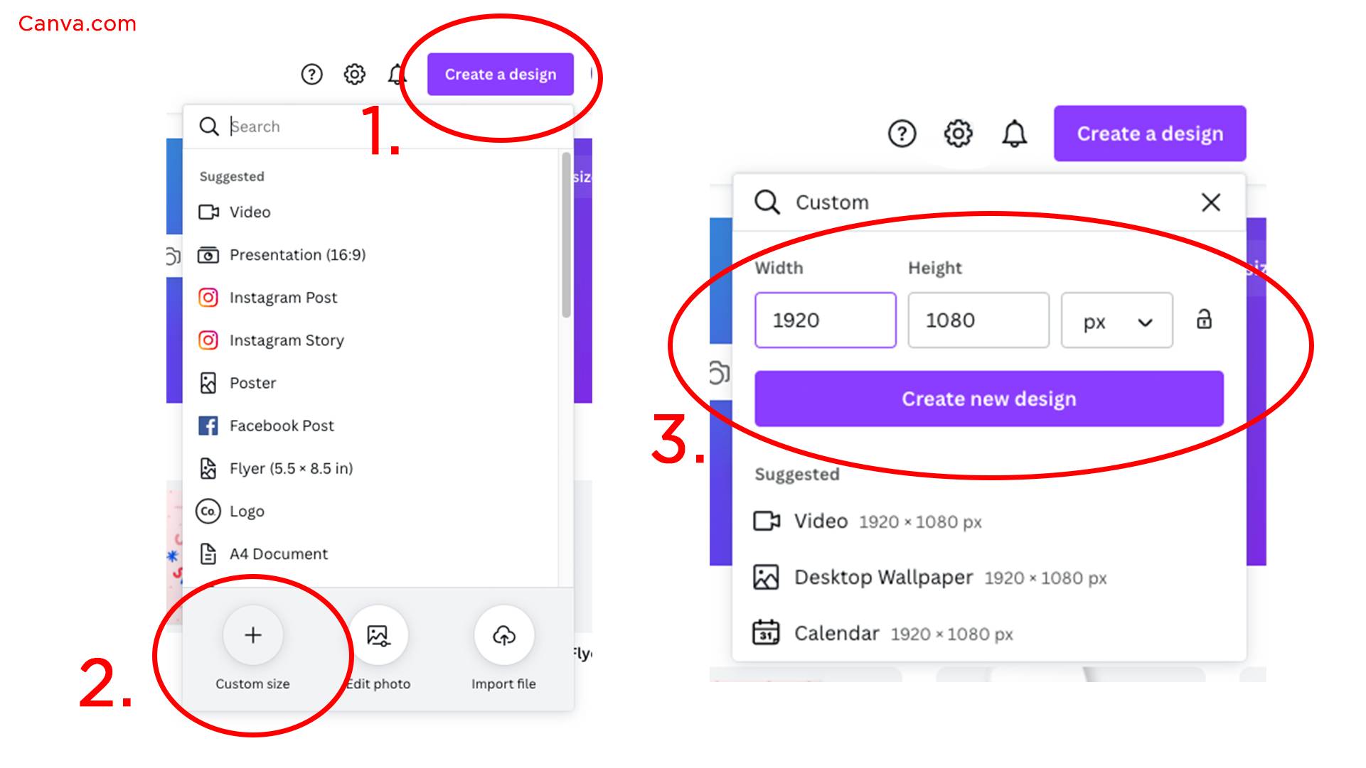
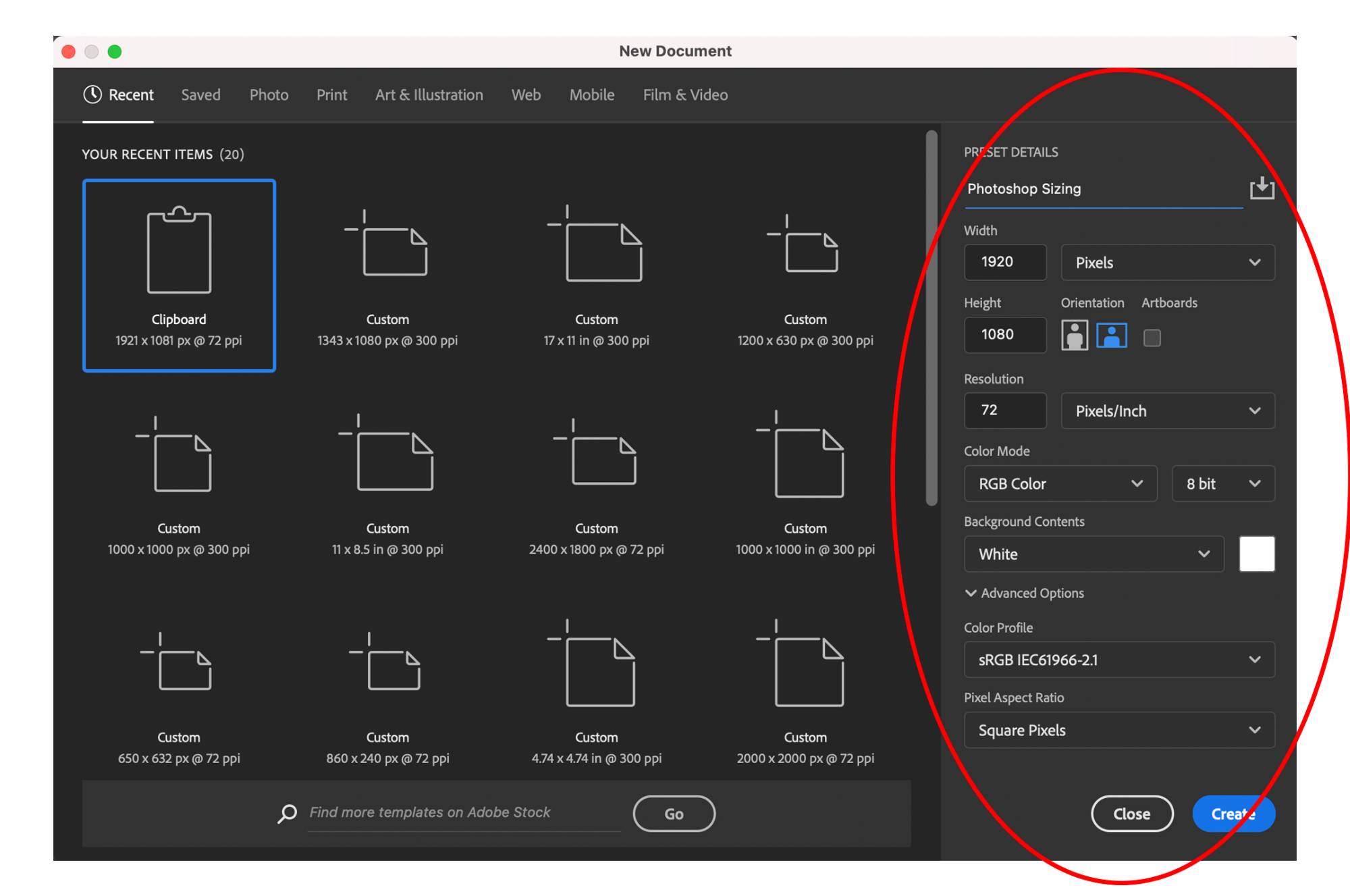
To save yourself time, we recommend creating your design with a custom size of a 16:9 ratio (1920 X 1080) so it can be shared on any social media platform.
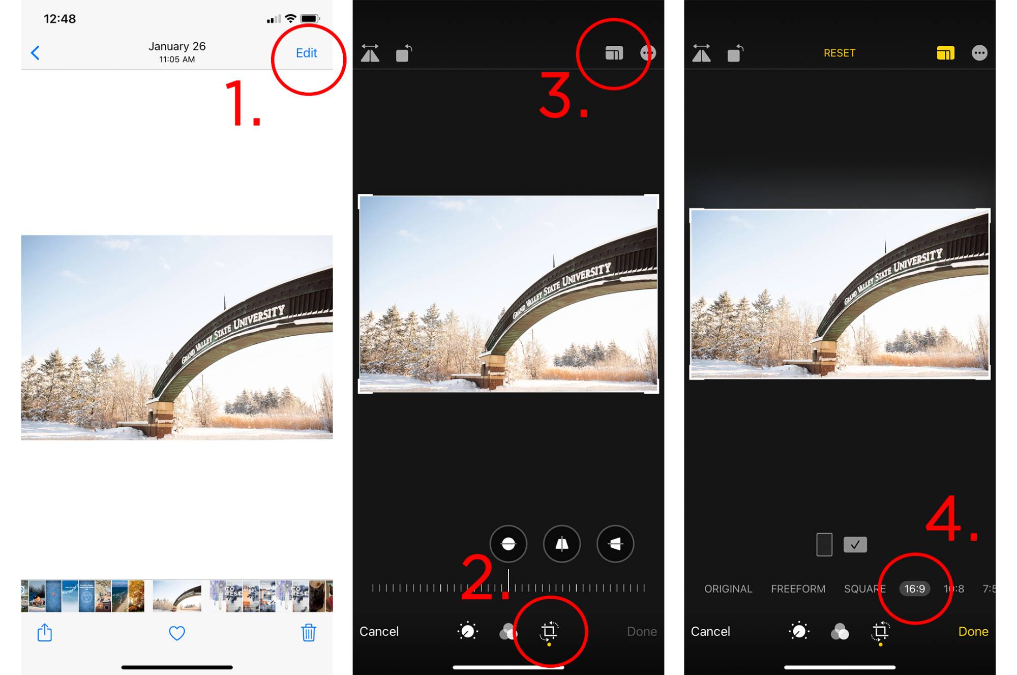
Attached are screenshots outlining how to size or resize images and graphics in Canva, Photoshop or on your iPhone.
Categories:
best practices
Posted
by
Sheila Babbitt
on
Permanent link for How to Optimize Graphics and Images for each Platform on March 15, 2022.


