Accessibility - Microsoft Windows
Text
- Text in a document should be at least 10px and in san serif fonts as they are optimal for magnifying.
- Avoid using text boxes as they are not not easily read by a screen reader.
- Avoid track changes or commenting in a Word document when working with a student using a screen reader. The screen reader often has a difficult time reading these comments in the proper order.
SAMPLE ACCESSIBLE SYLLABUS
To help you get started in creating an accessible syllabus, please download the following document, while paying attention to proper use of headings and styles if additional content areas are added. Further, it is helpful to use the accessibility checker that is built-in to Microsoft Word as a final check to help ensure that your syllabus is accessible.
- Sample Accessible Syllabus [Microsoft Word]
Headings
- Use headings to format your document. Headings contain information that allows screen readers to easily organize a document and allows the screen reader to skip over various sections at the user’s discretion.
- Make sure you are using headings in the correct order.

The headings menu in Microsoft Word
Images, Graphics, and Alt Text
- When inserting images or graphics in a document, consider whether it’s necessary or vital for a screen reader to know and understand what it is. If it is on the document for decoration it might be wise to leave it off.
- When an image or graphic does need to be in a document, provide alt text for this document so the screen reader can convey the image. This is done by selecting the format picture option when right clicking an image, then select alt text from layout and properties tab and typing in the description in the description field.
- When writing alt text, provide both a good visual description of the graphic and the purpose of including it.
- If your graphic is also a link, you don’t need to include that in your description as a screen reader will already inform the user it is a link.
[1501089488].jpg)
Links
- Never use “Click Here” or “Link Here”. Always use some sort of descriptor even if it is just the name of the website. A screen reader can quickly pull up all the links on a document but if all the links aren’t descriptive the user won’t know where to navigate.
Tables
- Screen readers read left to right, top to bottom, and a single cell at a time. Merging or splitting cells will throw the reader off and confuse those attempting to navigate through it using the tab button or arrow keys.
- Make sure columns have headers.
Colors
- Don’t solely rely on color to convey meaning. When categorizing something by color alone, those who are colorblind may not be able to tell the difference.
- Make sure you are using contrasting colors. For example, using a dark gray on black is hard to see for those with low-vision. Ensure there is sufficient contrast between your background and fonts. When in doubt use this Color Contrast Analyzer to verify.
Bold or Italicized Font
- Similarly to colors, a screen reader wont read the difference between bold, italicized, or normal font.
- When using them, make sure that the font's formatting isn't the only way that information is being conveyed.
Flashing or Blinking Content
- Flashing or blinking content can cause seizures in those with photosensitive epilepsy and should be avoided.
- If some content does contain flashing or blinking and it is imperative it is used, keep the flashing or blinking down to 3 times per second.
- Especially avoid red blinking or flashing.
- When a video or some other media has flashing, add a warning to viewers that the content contains flashing and indicate when it happens.
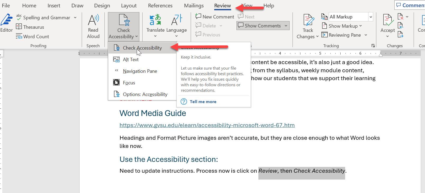
Use the Accessibility Checker
Microsoft Word has its own Accessibility Checker
- Go to File>Review>Check Accessibility
- This will open up an accessibility checker panel that will review your document in Word and spot issues as well as provide instruction on fixing those issues.